My Top 5 UI and UX Resources That Help Me Design Better
When I started learning UI and UX, I didn’t know where to begin. There were too many tutorials, articles, and design systems out there, and I kept jumping from one thing to another without really learning anything deeply. Over time, I found a few sites that I always return to. They’ve helped me build better habits, understand what makes good design work, and refine how I approach layouts, colors, and usability.
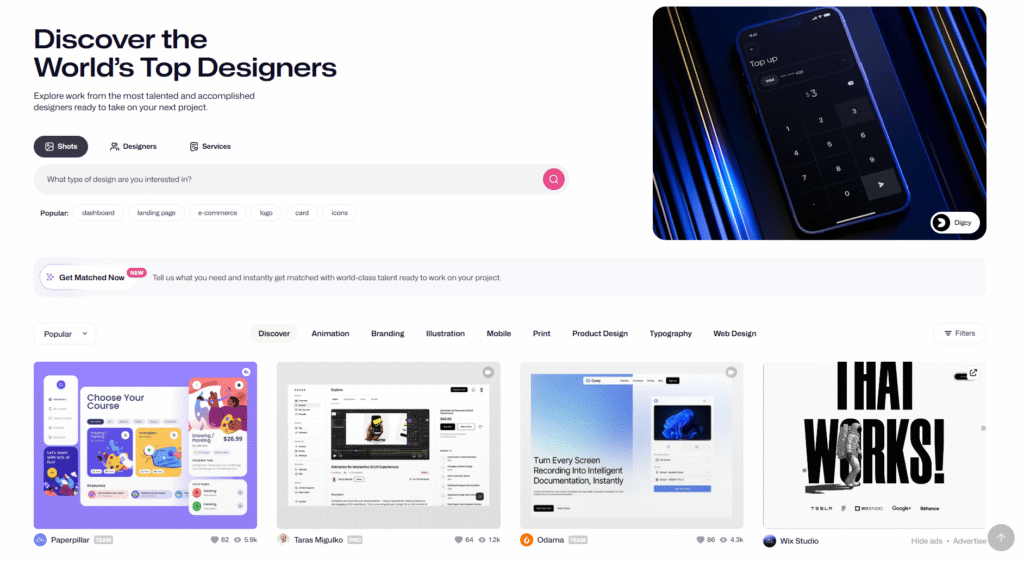
1. Dribbble
Dribbble is usually the first place I go when I’m about to start a new project. I like browsing through dashboards, apps, and website designs to look for inspirations when I have an upcoming project. Sometimes I focus on color combinations, other times on layout spacing or typography. It’s a great way to train your eye and understand what makes certain designs feel balanced and professional. Even a quick scroll helps me see patterns that I can adapt in my own way. Over time, it also helped me develop my personal taste. I started to recognize what kind of visual style I naturally lean toward and what feels too much for me.
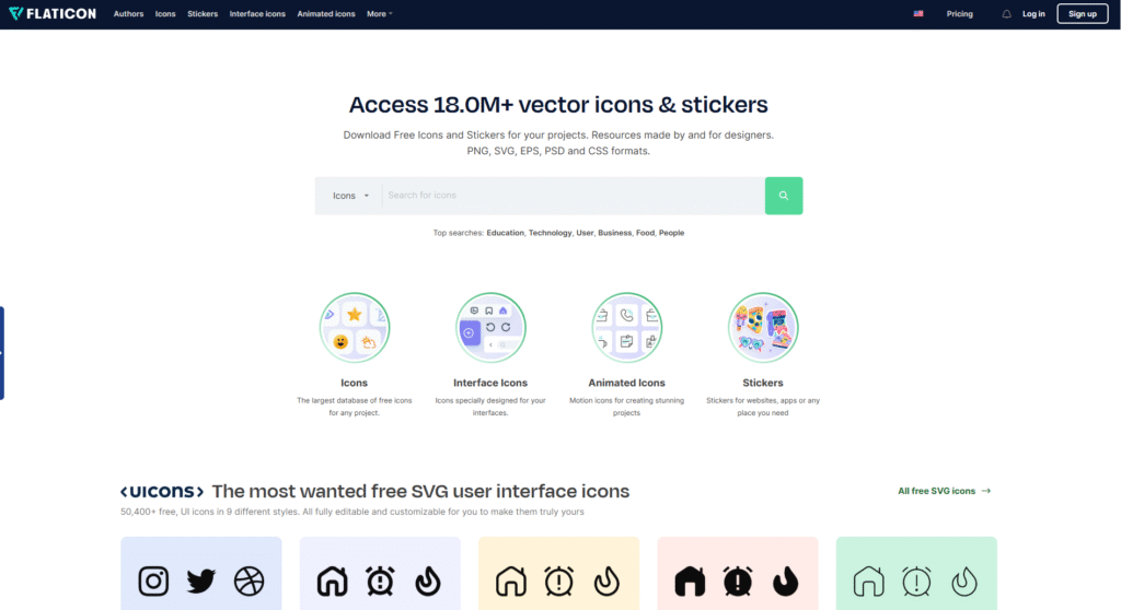
2. Flaticon
Flaticon is one of those sites I didn’t expect to use as much as I do now. I often download SVG icons because they’re easy to resize and recolor, especially when I’m working in Microsoft PowerPoint or Power BI. Being able to customize colors directly inside those tools saves me a lot of time. It also helps my work look more cohesive, since I can adjust icons to match the overall color palette. What I like about using it is that it’s not just about finding nice icons, it’s also about making sure everything looks consistent and intentional.
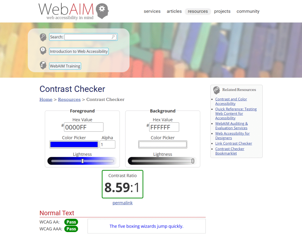
3. WebAIM Contrast Checker
The WebAIM Contrast Checker might look simple, but it’s one of the most useful tools I’ve come across. I use it to check whether my text and background colors have enough contrast for comfortable reading. The higher the ratio, the better the visibility, especially for people with visual impairments. This tool made me more aware of accessibility. It’s easy to get caught up in how things look, but design also needs to be readable and inclusive.
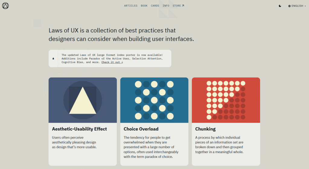
4. Laws of UX
Laws of UX changed the way I look at design. Before I found it, I mostly designed based on instinct or what looked good to me. After reading through all the principles, I started to understand how much psychology goes into creating a good user experience. It explains how people think, what they notice first, and how they process information. The lessons are short, but they stick with you once you start applying them. I often revisit certain laws when I feel unsure about a design choice.
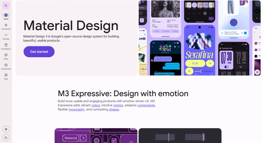
5. Material Design 3
When I first learned Figma, the Material Design 3 site felt like a full design textbook. It explains everything in detail, from color and spacing to motion and interaction. I learned a lot about consistency and structure from it. Even if I don’t follow every rule, it still serves as a solid foundation whenever I start a new project. What I appreciate most is that it doesn’t just give you guidelines. It explains the reasoning behind them, which helps you understand why certain decisions work better.
These resources have been a big part of how I learned and improved over time. I still use them whenever I’m working on something new or just want to refresh my approach. It’s nice to have places I can always go back to whenever I need a little inspiration or a reminder of what good design looks like.