A redesign of an existing dashboard used to monitor key workforce metrics such as headcount, diversity, hiring trends, leaves, and terminations.
Goal
The old dashboard was cluttered and visually inconsistent, making it difficult for users to interpret data quickly.
The goal was to create a more streamlined and professional interface that presents insights clearly while remaining visually balanced and intuitive to navigate.
Design Process
I started by reworking the information hierarchy, grouping related metrics and simplifying chart layouts for better scannability.
The design focused on cleaner spacing, better color use, and improved typography for data readability.
I also adjusted the visual rhythm to guide the viewer’s eye naturally from summary to details, ensuring that key metrics stood out without visual noise.
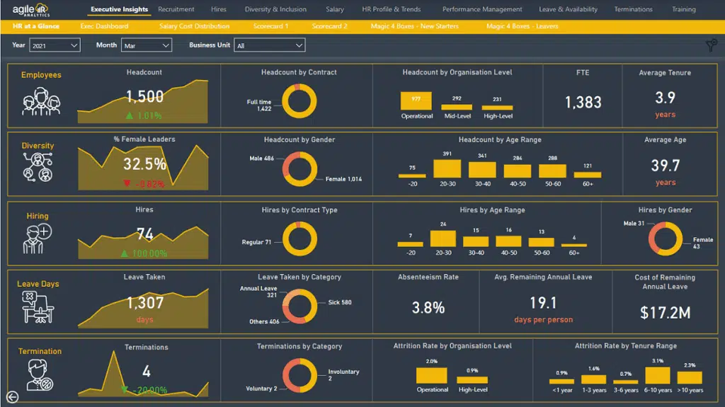
Before Version
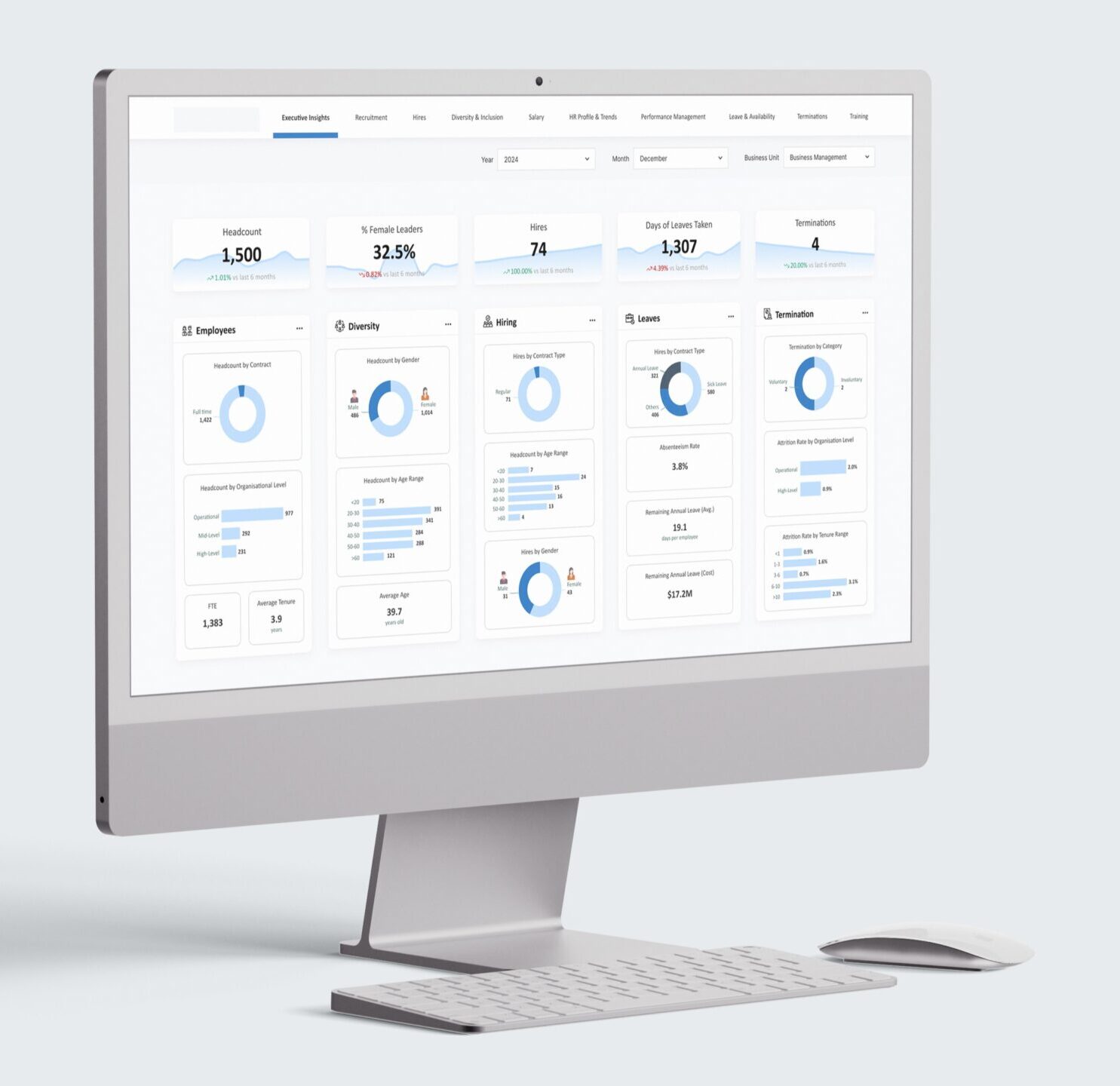
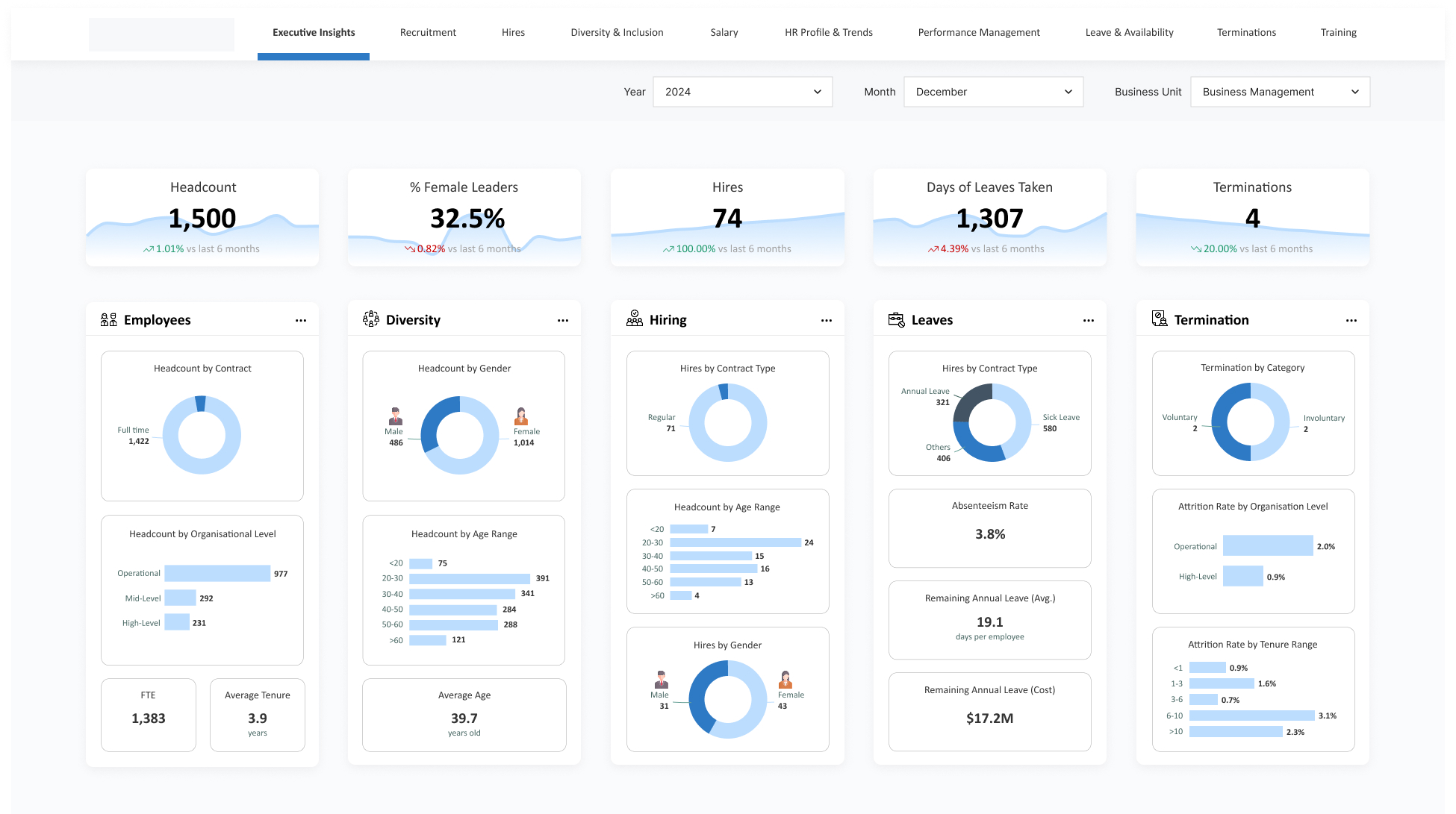
Final Output
The revamped dashboard feels lighter, more modern, and easier to interpret at a glance. It delivers a professional look while maintaining function and clarity to help users gain insights faster.
Revamped Version
Reflection
This project reminded me that it is not just about making a tool look clean, but also making it feel easy to use. I learned to pay closer attention to hierarchy, spacing, and flow, since small tweaks can drastically change how users digest information more efficiently.